Blockshop DC is a startup event and workspace for professionals in the cryptocurrency and blockchain market. Their space is located in the historic neighborhood of Dupont Circle.
Project Details
Client
BlockShop DC
My Role
UI/UX Design
HTML5 Website Design
CSS3 Styling
Front End Development
Tools Used
Adobe XD
Adobe Dreamweaver
Adobe Photoshop
Adobe Illustrator

Problem
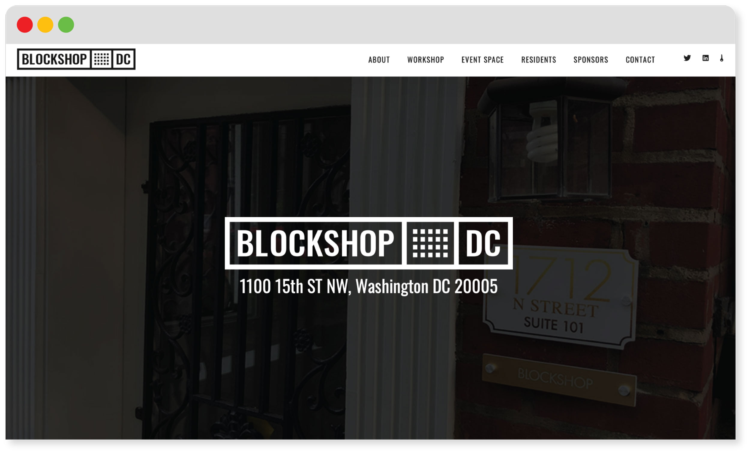
BlockShop DC needed a website that could showcase their space quickly and effectively. We agreed that the site should only include the necessary information and should not have superfluous items, like a blog, photo gallery, or calendar. BlockShop had existing branding, but did not have any work toward a website. Being in the tech industry, they had some qualifications for how the site would be built.
Solution
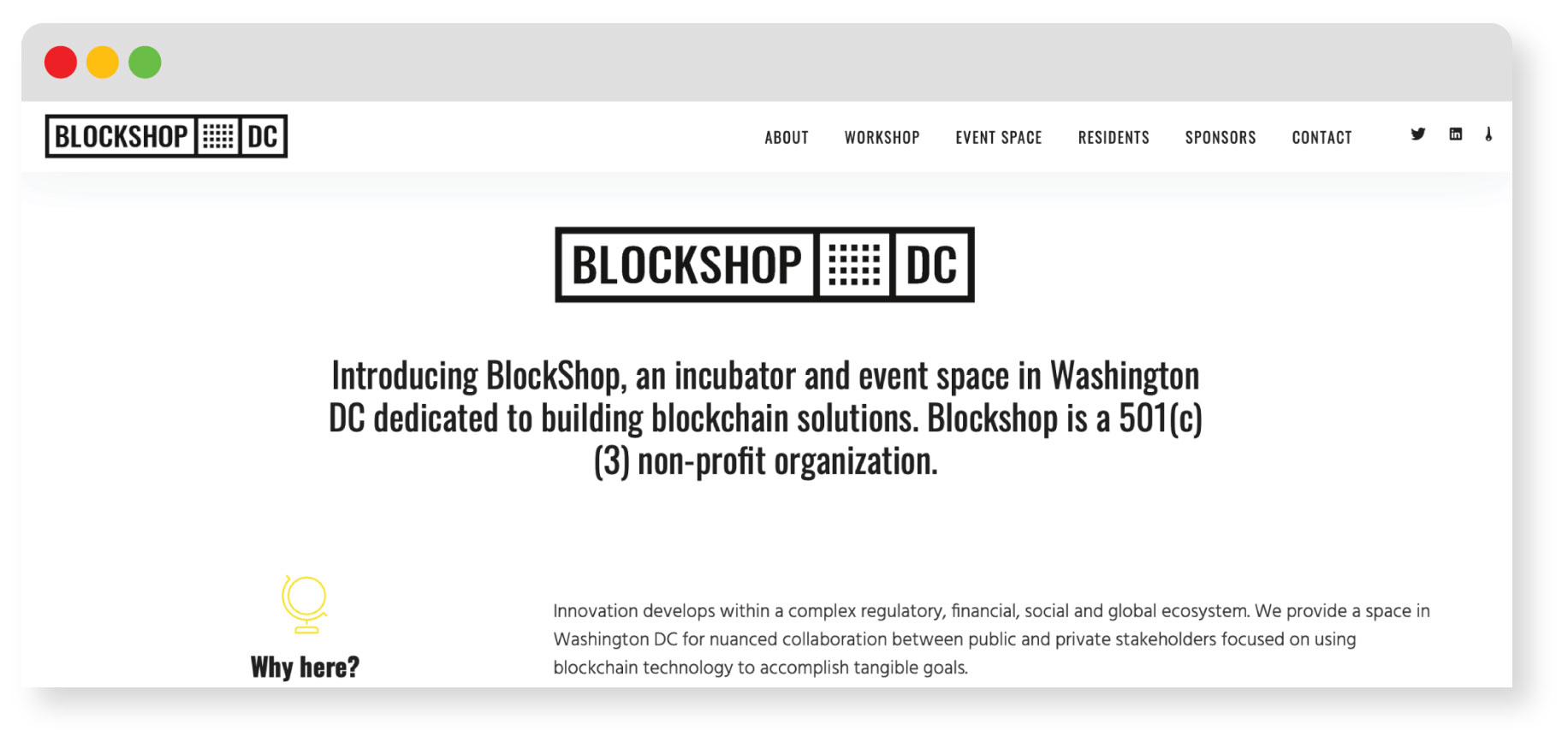
Being in the tech industry, they had some qualifications for how the site would be built. One of the main requests was that the site be built in static HTML and CSS, due to the security and lack of users that can access the backend. They also wanted to have a way to manage the code off of an FTP server, so we settled on hosting the site on GitHub. This allows for a website that has built in versioning with the safety of a static HTML website.
Design
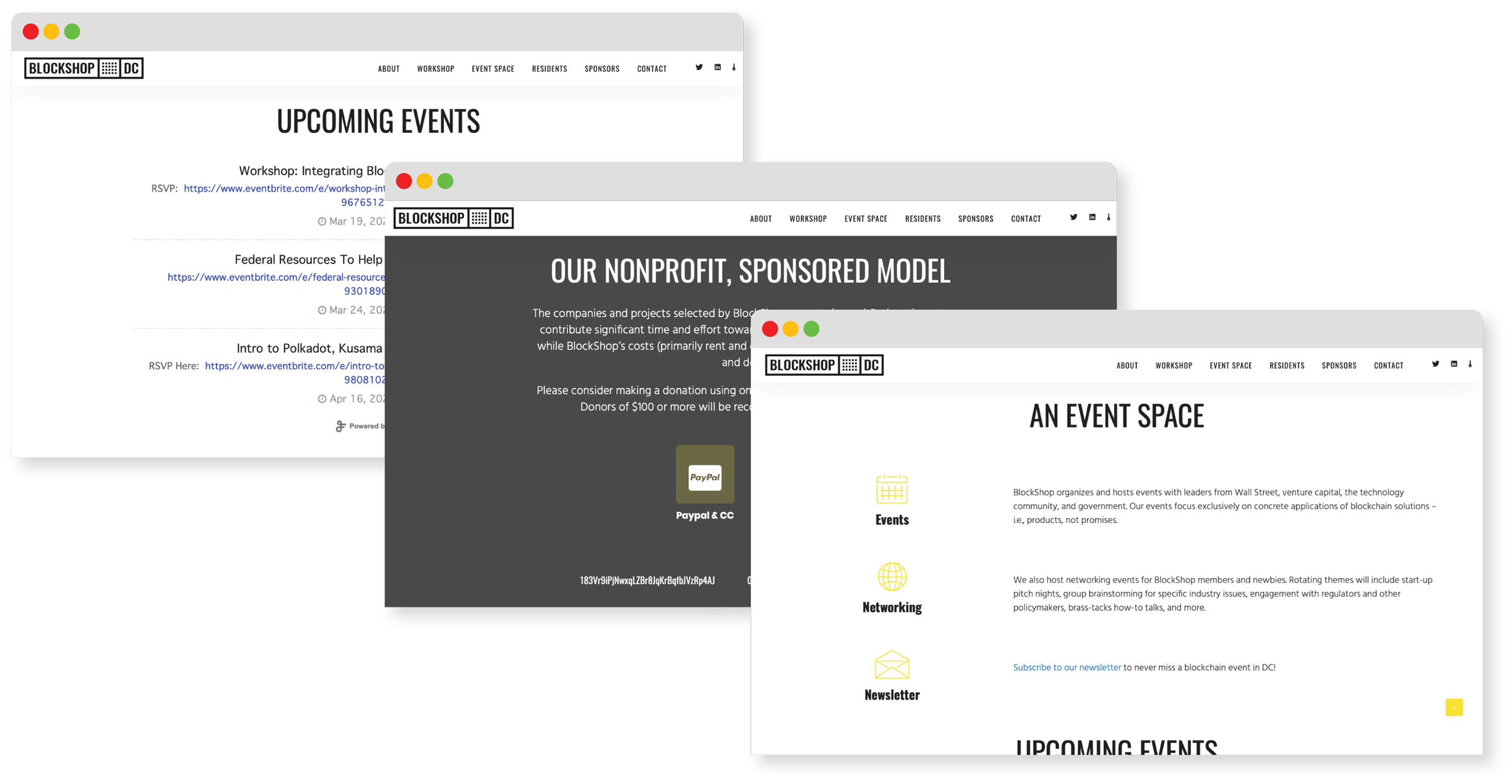
Early in the process we decided that a single page scrolling website would be the best solution. In addition, we included a fixed header navigation bar. This allows the user to easily navigate the website, while keeping the information concise.
While the majority of my clients request WordPress based designs so they can easily update them, I’m always up to the task of a simplified HTML and CSS website design. Handling both the UI/UX design and the front end HTML development made this project move very quickly.
Being tech oriented clients, BlockShop DC insisted on checking the code to make sure that nothing was superfluous and the end result was error-free.
Mobile View
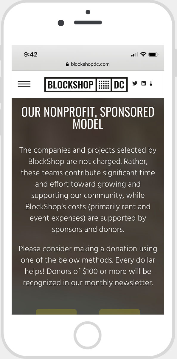
In our initial research for the target market of BlockShop DC, we saw that the average user would be viewing the site on mobile. It wasn’t by a small margin either, over 80% of the users were anticipated to be viewing the site on mobile devices. While a responsive design was the goal anyway, we decided to build the site mobile first and scale up for the desktop users.
The site was prototyped in Adobe XD for mobile and then elements were resized to meet the larger displays. Using Bootstrap framework, this was relatively easy and the end result is a seamless design that accommodates all screen sizes.
Copyright 2026 Trip Ulvila
